The power of visual ideas. The election explained by advertising creative director.
In the advertising world, we love a good “visual solve.” When we see a really good one we’ll often say to one another. “Wow, I wish I would have thought of that.” There’s a simplicity of communication that’s not easily done with words. Words can get complicated and require a lot more words to explain them. A great visual ad is immediate. It doesn’t need the proverbial thousand words to explain it. It goes straight to the subconscious.
Don’t believe me? Millions and millions of dollars were spent for years to try and stop smoking by explaining the dangers. It wasn’t until the Truth Campaign visualized the danger they began moving the needle in the other direction. With the below TV ad and a physical road show to youth events.
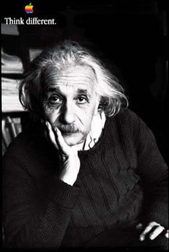
Some other great executions have been done over the years. One of the more relevant ones for the current campaign is the Think Different campaign from TBWA/Chiat Day for Apple. Various faces embody the idea of thinking differently and therefore making a difference in the world.
In Contrast, the two campaigns have the taglines Stronger Together and Make America Great Again. Neither tagline is exceptional from a creative standpoint. I can’t imagine a engaging advertising campaign built around them the same way as Rolling Stone’s Perception Reality or Absolute Vodka’s campaign.
Make America great again when applied to the Donald more or less works no matter how you view him. Even if you don’t like him it’s more or less positive a positive statement you can’t argue against. If you know very little about him it’s something you can agree with. Yeah, American great is something I can get behind.
Stronger Together on the surface seems fairly equal. It also has a nod to the idea of a social movement type of ideas that agencies and marketers are excited about these days. We can all join in the campaign and the movement to bring a woman to the office of the presidency! There’s a problem though. It’s incongruous with her physical presence, especially compared to Trump. Not him being male either. Remember, Bill Clinton would go jogging? He showed a vitality that the old reserved WWII hero, George HW Bush and then Bob Dole both lacked. It worked.
Unfortunately Hillary doesn’t project the same sort of fitness and energy that her husband did back in the day. Even he doesn’t, especially compared to Donald’s spouse. Add to that Trump’s year of telling us Hillary doesn’t have the stamina to run for President. Now she has stumbled again and may have pnemonia. The visual imagery of the campaign is looking extremely problematic in relation to their slogan. It doesn’t matter if the conditions can be explained away. The visual communication is more powerful than the words that describe it. Seeing her fall and cough says that she’s not stronger and we’re not Stronger Together. She’s even appears to be a drag on the people around her that have to hold her up. The electorate will not vote weakness into the oval office. This is why FDRs was covered up! The visual side of this election isn’t even close.
Yes, there’s still time for this to correct itself. It’s a long way till election day. And sure, Trump may have his own medical emergency. He is about the same age as she is and may have his own problems. Visuals are only part of the campaign but they are very important. And more important that most people realize.
I’m not endorsing either candidate for president. I will vote third party like always this election.
Posted on: September 12, 2016, by : Jimmy Gilmore